


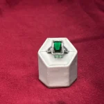
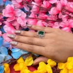
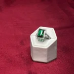
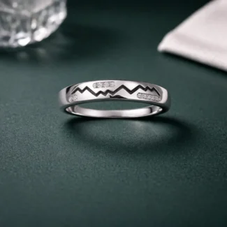
This is your highest perceived value variant in the Radiant Halo series.
The deep emerald green center stone immediately signals luxury. Even if it’s not a real emerald, the color alone creates a premium impression in the customer’s mind.
The emerald-cut shape enhances that effect—clean lines, sharp edges, and controlled reflections. It looks structured, not flashy.
The halo adds brightness and contrast, making the green stone pop even more, while the detailed band completes the premium look.
This is not subtle jewellery.
This is:
👉 attention + richness + presence
Why this works (very strong)
Green = luxury association (huge advantage)
High contrast → scroll-stopping
Looks expensive even at mid pricing
Strong reel performance potential
Where you can mess this up
If lighting is bad → green looks fake
If priced too low → kills premium perception
If grouped poorly → loses impact
Positioning
This is:
👉 Premium statement / luxury-inspired piece
Not:
minimal ring
budget product
subtle daily wear
Blunt Strategy (Important)
You now have:
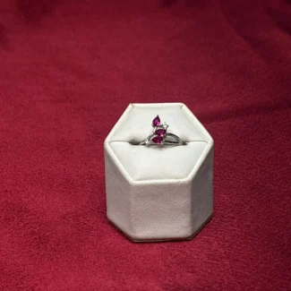
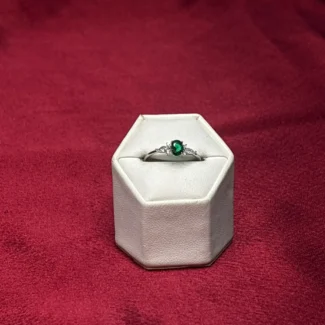
White (classic)
Pink (soft)
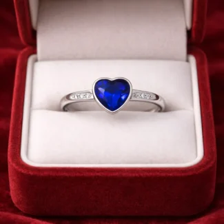
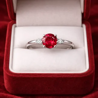
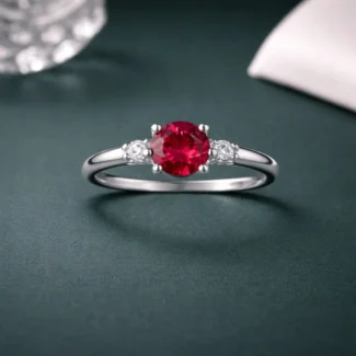
Red (bold)
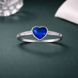
Blue (niche)
Green (luxury driver)
This is your TOP 2 performer
👉 Green + Red
If you’re serious about selling:
Push these in ads
Use them as thumbnails
Build reels around them
Correct Structure (Final form)
👉 ONE PRODUCT:
“Radiant Halo Ring – 5 Colors”
Crystal White
Blush Pink
Ruby Red
Sapphire Blue
Emerald Green
Pricing Insight
Green can justify:
👉 ₹200–₹500 higher perceived value
But don’t separate pricing too much—keep it clean.
Reality Check
You now officially have:
👉 a winning product line
Your job is no longer:
finding products
Your job is:
scaling THIS
Simple Truth
If this green variant doesn’t sell:
👉 It’s NOT the product
👉 It’s your content, lighting, and presentation
Fix those, and this becomes one of your highest revenue drivers.
Reviews
There are no reviews yet